Many businesses spend more on their lobby couch than their logo.
So...first impressions?
There’s a lot riding on a logo. And, for a designer, logos can be the most rewarding yet nerve-racking projects to work on. You have to maintain a great design that defines and promotes the organization, while navigating committee votes, opinions and reengineering.
Often, logo design was left out of the initial budget. Many businesses spend more on their lobby couch than their logo. Don’t get me wrong, I love a good tufted Chesterfield, but there’s nothing like a great logo to make a first impression.


THE GREAT UNDOING
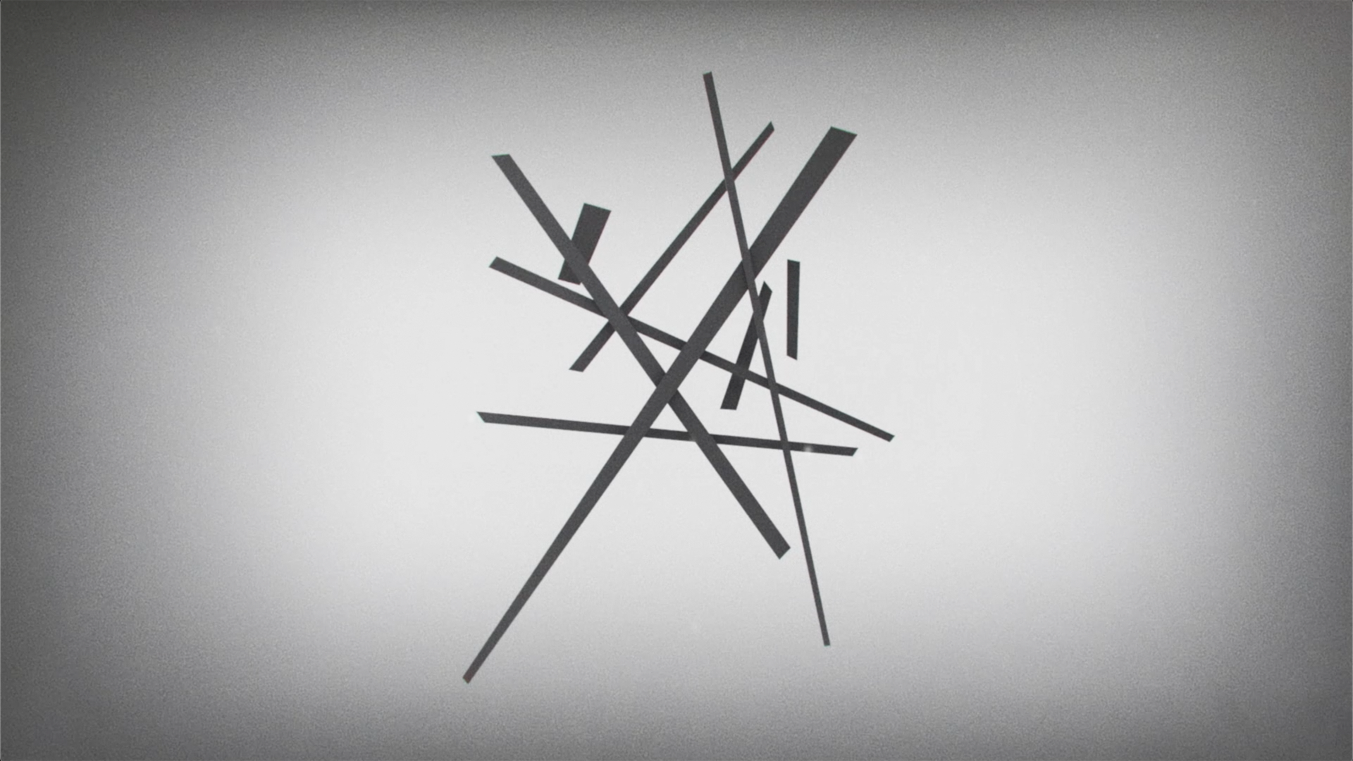
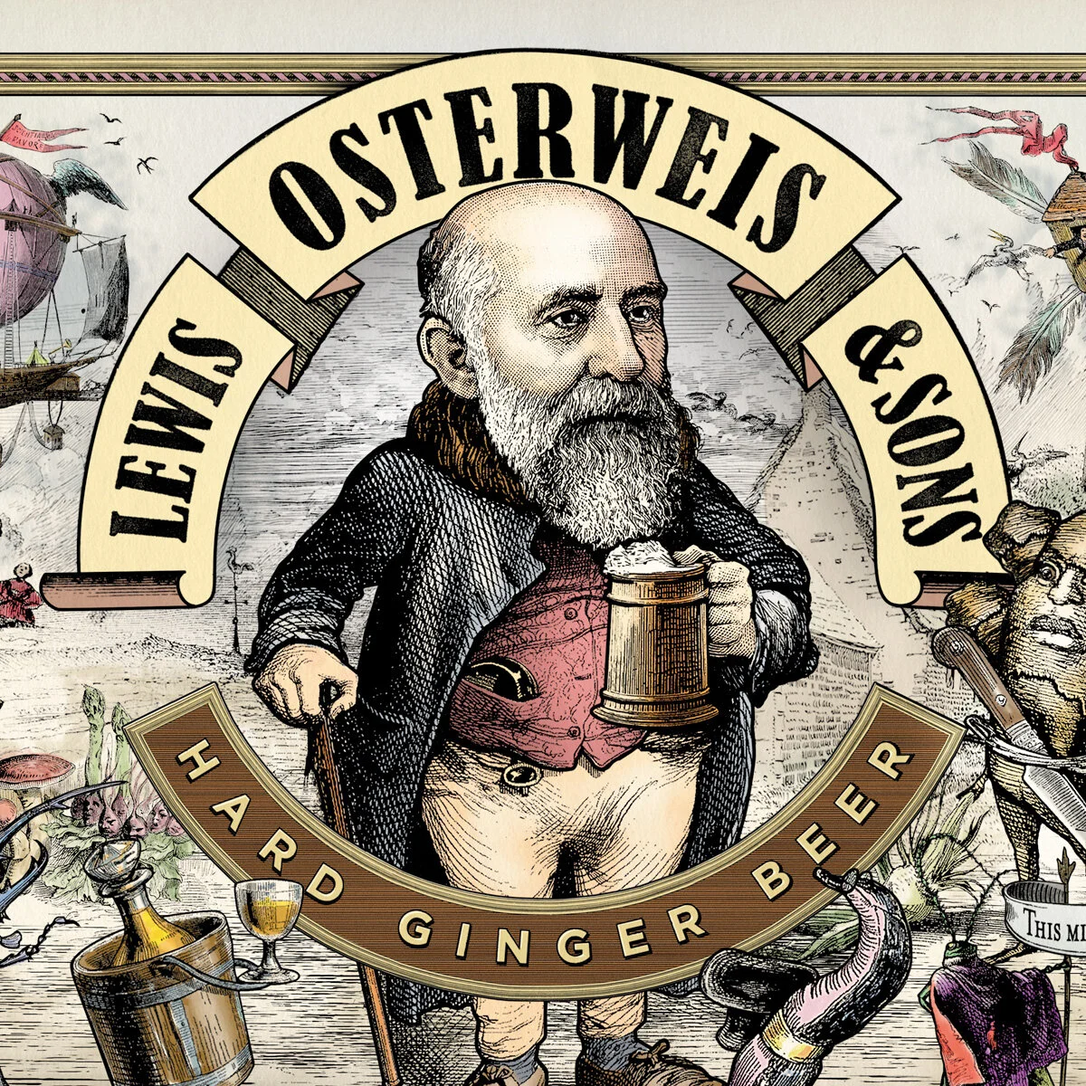
As the 100th anniversary of America’s involvement in the Great War approached, we were asked to create a new logo for the National World War I Museum and Memorial. Seeking to go beyond what everyone “knows” about the war, we wanted to express the constructive as well as destructive energies it released.
We used intersecting lines to evoke the stakes upon which barbed wire was hung in no-man’s land, the railroad tracks that fed men and munitions to the fronts, the factories where new weapons were created—and the shattered villages where they were used.
Just as readily, we can discern larger, more hopeful themes: the intersection of individual lives and entire peoples; the creative chaos of old cultures meeting new ways of thinking and living and, finally, a glimpse of the startling art forms that emerged in the aftermath of the conflict.


BRANDING A NEW ERA
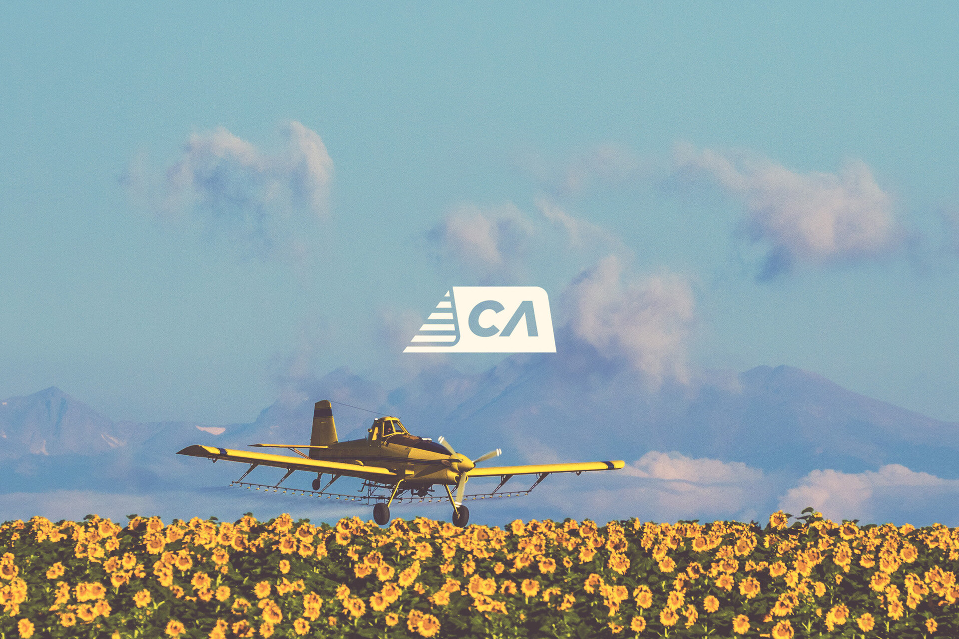
Crop Air has been a family owned crop dusting company for over forty years. In 2017, ownership switched to a new family. With this new family came renewed vigor, and the need for a new logo. Their old logo was in bad shape, but everyone involved still loved it’s retro quality. With the rebrand, it was important to reflect on the past, while making a bold statement for the future. The new logo pulls cues from a rich history of air travel, while infusing the category of agriculture.


NEW GOALS
Since it’s founding in 1992, Lou Fusz Soccer Club has grown to 160+ teams, as well as adding a lacrosse club. Soon to add field hockey and volleyball, the organization wanted to broaden their Identity beyond soccer, and consolidate under the umbrella brand Lou Fusz Athletic. In developing a new logo, the organization wanted a simple bold mark, that paid respect to a heritage the club has been built upon. Manditory, the logo also had to incorporate the iconic St. Louis Arch.


STORE TO DOOR
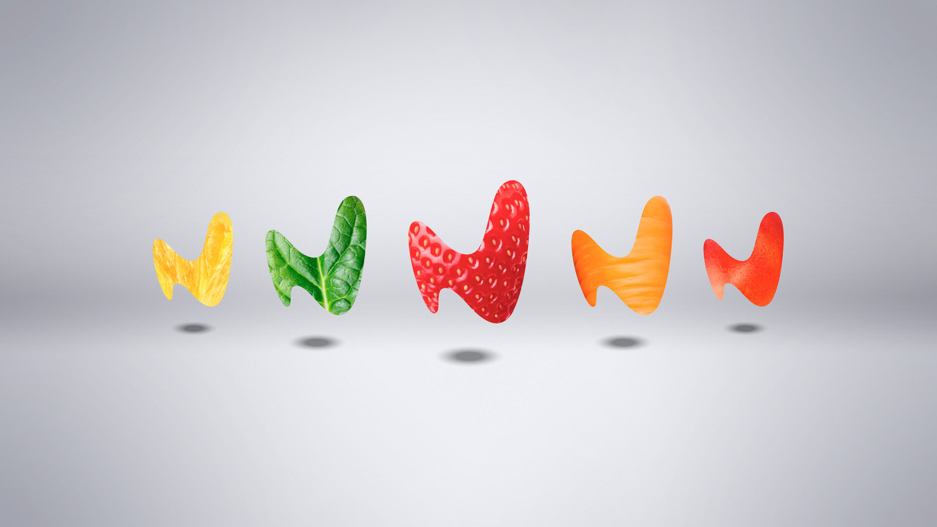
An “N” born from the crown itself presents itself with buoyant optimism. A modern, clean badge with a technical typeface that reinforces clean ingredients, portioned and packaged with precision, for nourishing your specific purpose.