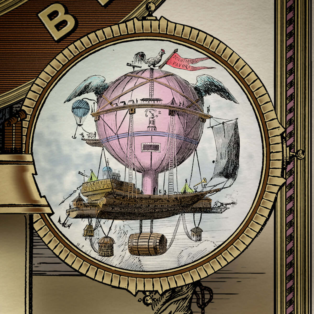
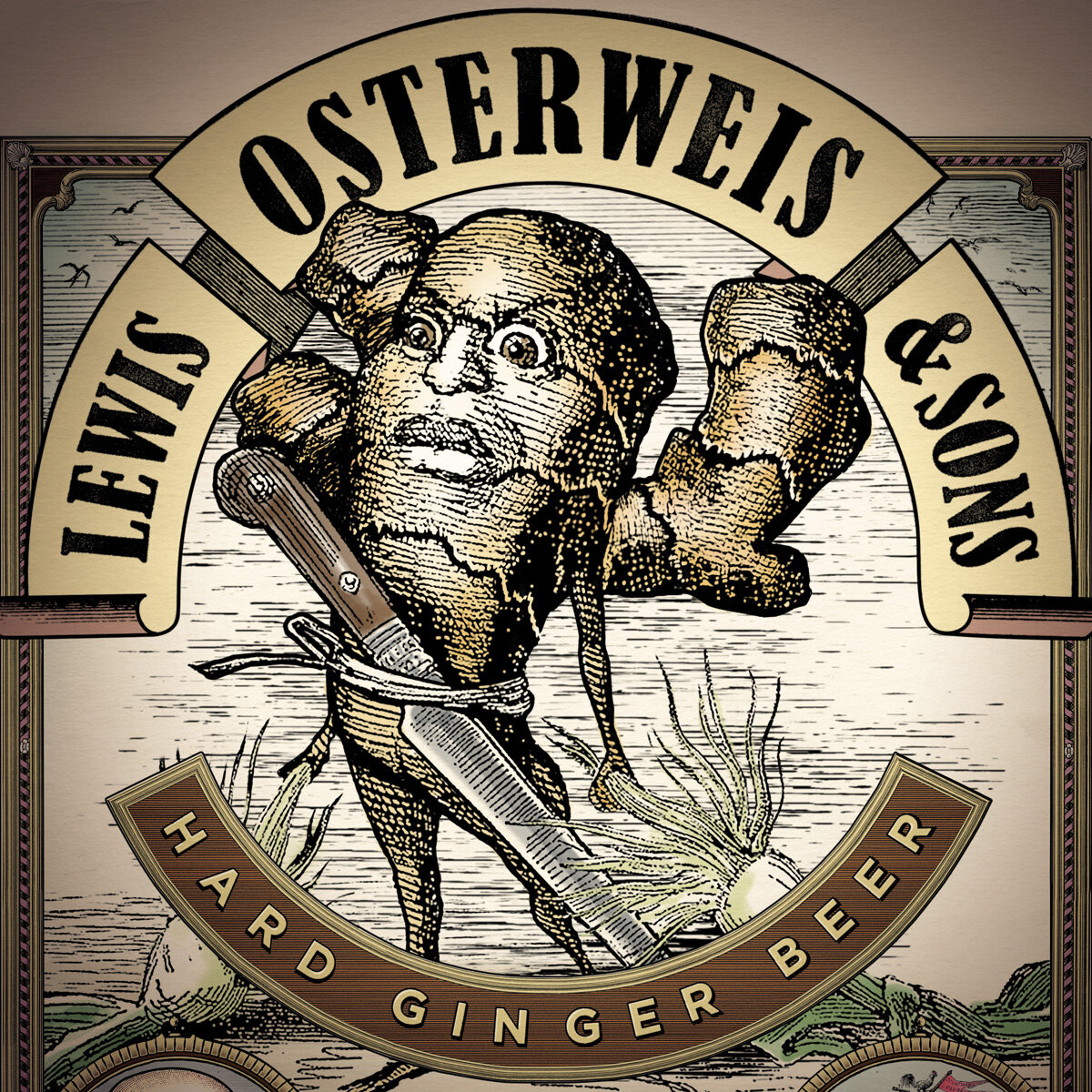
LEWIS OSTERWEIS & SONS
An experimental product from the Schlafly Brewing Company, Lewis Osterweis & Sons was a spicy blend of craft and ginger beers. Named after the founder’s great uncle, Lewis Osterweis became the perfect subject to lead us into a bizarre world of winged airships, strange explorers, and a place where ingredients come to life, literally. The packaging became our vehicle to tell our crazy adventure story. Inviting consumers to join in, that is if they’re brave enough. Our six pack carrier was our lead item. Details from the carrier were utilized in social media, point of sale and advertising. It begged for engagement. And ultimately had people asking, “What the hell is it?”


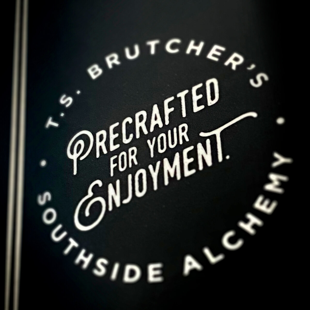
SOUTHSIDE ALCHEMY
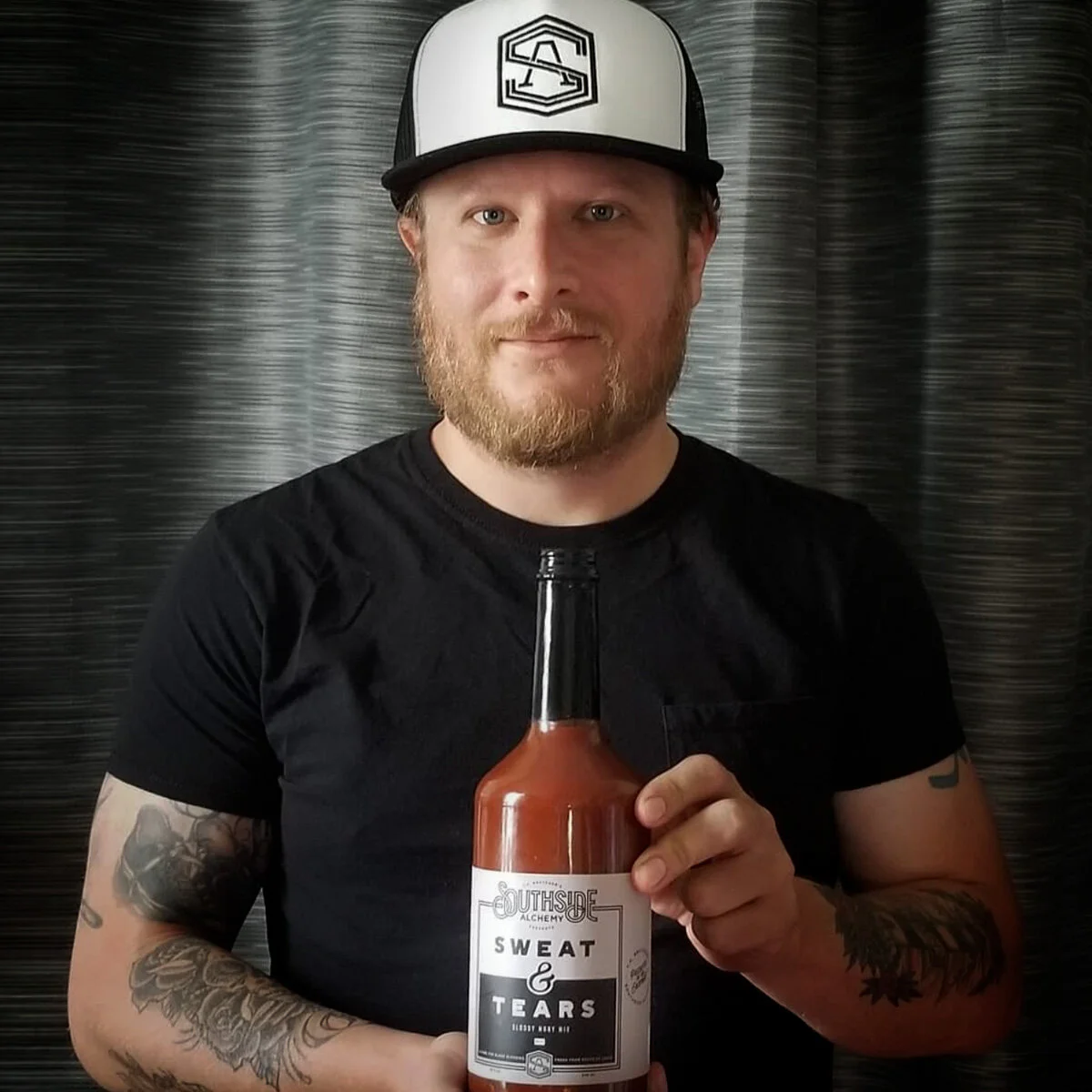
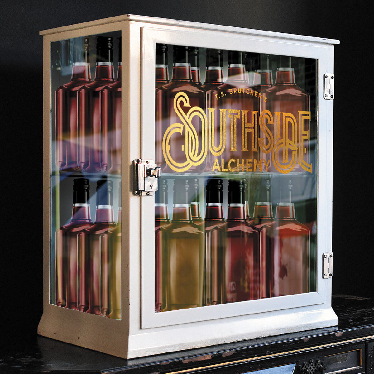
From the complex mind of madman mixologist Todd Brutcher, comes a flavorful new brunch staple. Brutcher is known for creating adventurous sangrias, shrubs and tinctures. When he decided to take on Bloody Mary mix goliath Zing Zang, his approach was, well, small and local. All kidding aside, his blend is complex and savory, with the right amount of heat. When it came time to package his tomato squeezin’s, we took a top-down approach. We started with building an umbrella brand that can house more than just the Bloody Mary mix. T. S. Brutcher’s Southside Alchemy was born. After that we quickly turned to naming the mix. With a play on the word ‘blood’, and a nod to Brutcher’s hard work, we landed on “Sweat & Tears”. The first 30 cases sold out in the first month, and new sights are set on more flavors, including a more mild green tomatillo version. Yum.


1991-2012
SCHLAFLY BRAND REFRESH
Approaching their 21st year in business, Schlafly, one of St. Louis’ original microbreweries, felt it was time to give their brand a refresh. Their tattered grimy look served them well for twenty years, but now that they’re of ‘drinking age’, they felt it was time to clean things up. At least a little. And, over the years they had added many different beers with each label taking on it’s own interpretation of the brand look.
My goal was to refine things a bit, but retain many of the aspects people had grown to loved about the brand. I also wanted to create a design system all of the different varieties could live under. Lastly, I gave them several illustrations to use for the many needs they had beyond the packaging itself.

2012+


PACKAGING EXTRAS